Miniature Painting Tutorials
How to Extract Color Palette from an Image for Miniature Painting
Hi, Roman of Frontier Wargaming here. This is our very first article on FrontierWargaming.com. I will explain the goal of the Picture Palette challenge and walk you through on how to generate a color scheme from any image or a picture you took.
What is the Picture Palette Challenge?
The Picture Palette Challenge is the newest edition of our “Miniature Painting Challenges” series that takes place in our Facebook Group. The goal of the challenge is simple – take a color palette from an image and use it to paint a model. You don’t have to replicate all the colors and textures from the picture. The main point is to work with colors present in the image. How you use those colors is up to you.
In traditional art, it is a common practice to copy colors from photos. This practice allows us to learn and understand how to use colors better. It also allows us to get a better grasp on shading and highlights. Since you can see exactly which colors go into each shade, mid-tone, and highlight. It’s a great challenge to tackle for both novice and experienced painters.
Where to start
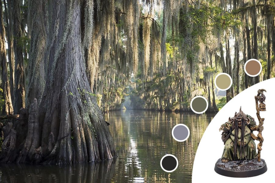
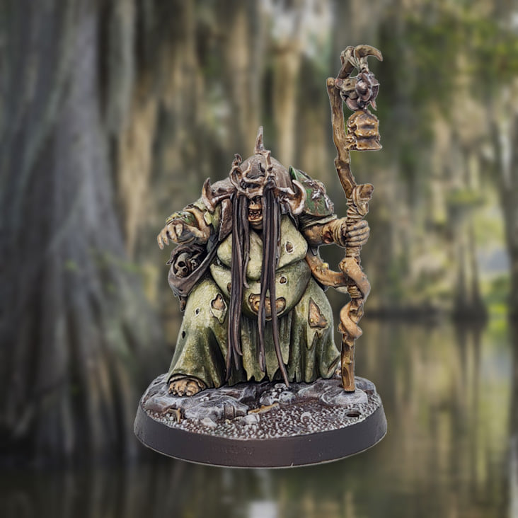
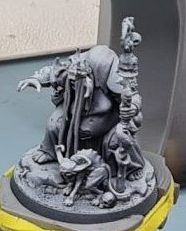
The 2 things to consider are the model you want to paint and the picture you want to use. You can start with either one. In my case, I started by picking a model. Luckily I had a wonderful Fecula Flyblown from Beastgrave: The Wurmspat box set lying around waiting to be painted. I often use the term “swamp hag” to describe the model. That’s how I decided to use a picture of a swamp to paint her.
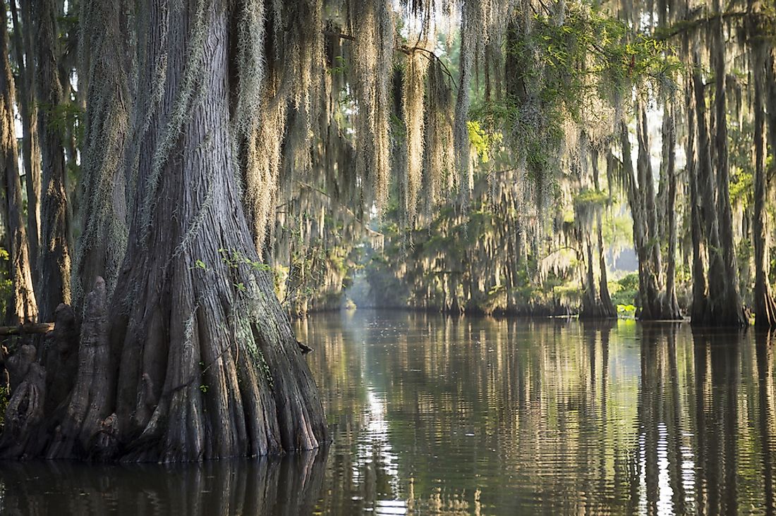
Since the nearest swamp was out of my reach I used google to find one. Searching through google yielded many great results. When looking for an image I recommend paying attention to the overall color tone of the piece. Look for tones and colors that you want your model to be. Pay close attention to small details on the image. That one small detail may have the color you need. The image I chose had all the colors I thought I needed. Browns for the dirt. Variety of greens for clothes and armor. Pale blue-grey for contrast. And a lot of off-white colors.
Extracting color palette from an image
Getting colors for your palette is the first actual challenge. I found 2 general ways of generating a palette. The first option involves photo editing and drawing software, like photoshop or paint. The second option involved online resources for generating color palettes.
Photo editing software
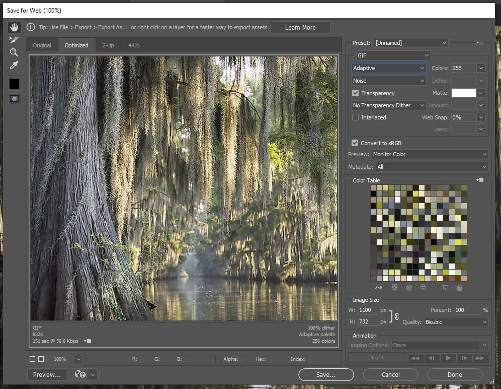
Photoshop and paint were used in my case. I uploaded the picture to photoshop since it has inbuilt tools to speed up the process. A palette was generated by pressing file>export>save for web. It auto-generates a palette using the most common colors in the picture. This may vary depending on the software you use.
Colors can also be picked manually. It’s a little bit more work but the results are just as good.
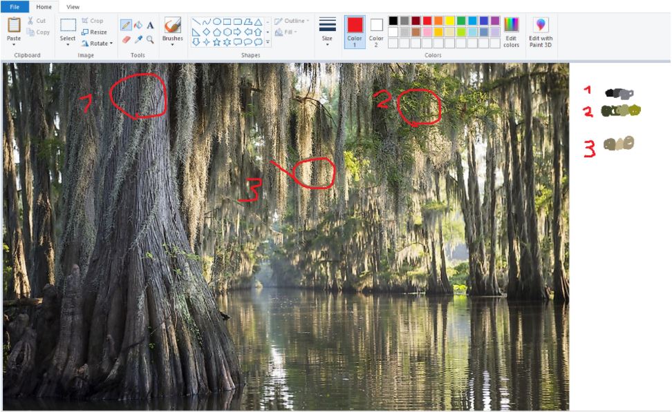
This method also allows you to study what colors make each material. It can be done in paint or gimp. Start by picking an area to generate colors from. I suggest picking at least 4 colors from each area to see what colors make highlights, base tones, and shades. Having variety also helps to narrow down base colors. I found that some colors can be replaced by mixing just two of the colors I picked previously. The end result is the same for both options. You get a palette with a variety of colors to pick from.
Online palette generators
Online color pickers show dominant colors on images. It is a great option if you are using a phone or a tablet. For this example, we used Palette Generator from Canva.com and Multicolor Engine. Both gave us results similar to Photoshop. There is less variety, but the colors given are a good starting point.
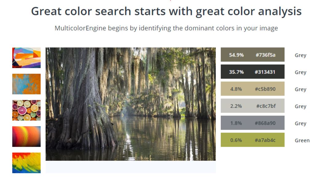
You can also use this method to get colors from specific areas. Crop down the image to the area you want colors from. It can be done in most programs even the gallery app on your phone. Then upload the cropped image to see results.
Matching colors to paints
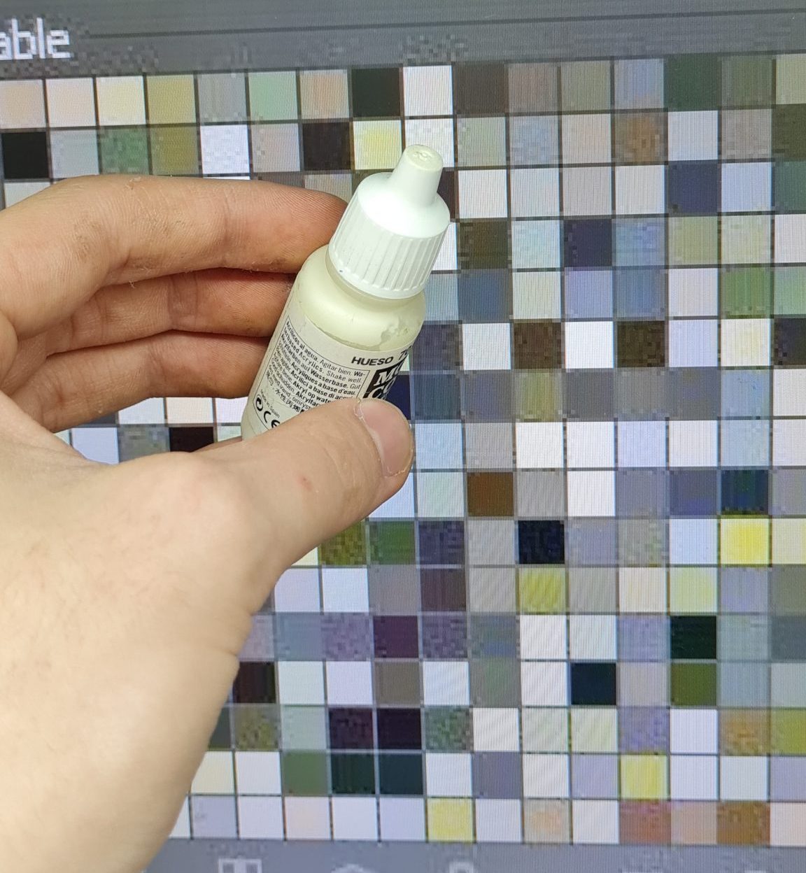
The next part can be considered subjective. It is hard to match a color 100%. Color perception will vary depending on your screen settings and ambient light. Most of my paint bottles have paint smeared on the cap to help me see how it will look dry. This is why picking colors was as easy as comparing the cap to the color on the screen.
Final Thoughts
In the end, I had 26 paint pots to use. Picking colors can be considered a crucial step. Try to cover as many colors that you think you will need. Often I use purples for painting wounds and shades on models. Not having it ended
up being an extra hurdle in my painting process. However, it also gave me a valuable lesson. It forced me out of my comfort zone and made me improvise, adapt, overcome. I will talk more about the painting process of Fecula Flyblown in the next week’s article.

Roman
September 2021

